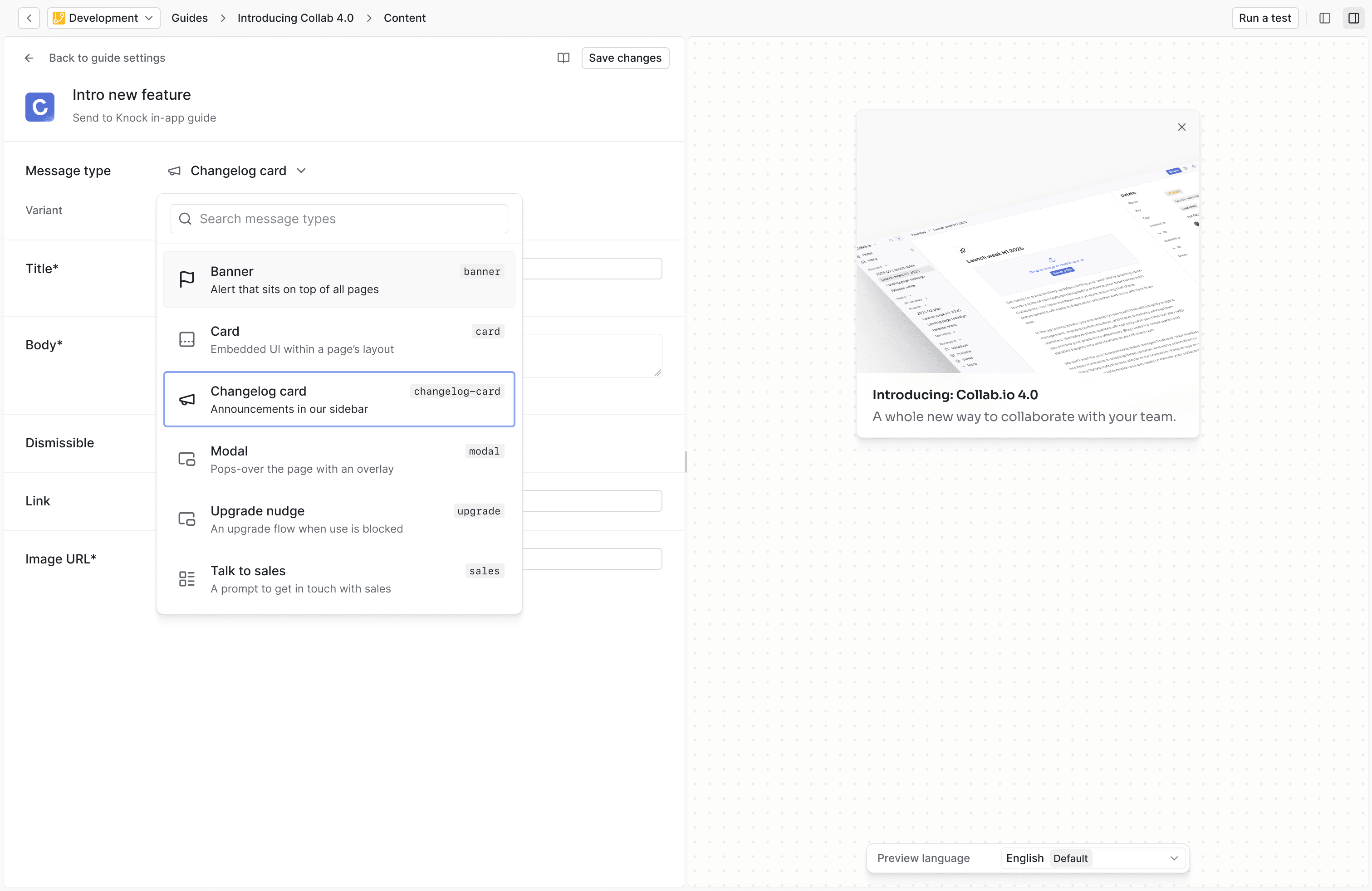
Message types
Message types map the components in your application to the guide editing experience in Knock.
A message type maps to a UI component/element in your product that you show to your users.
Once a message type exists, you can use it to create guides to render non-feed messages in your product.
Overview
#A message type has:
- A schema. A schema defines the fields a message type will have in the template editor and forms the structure of the message contents returned by the guides API.
- At least one variant. Message types can have one or more variants.
- A template preview. A template preview is a visual representation of what the message type will look like in the template editor.
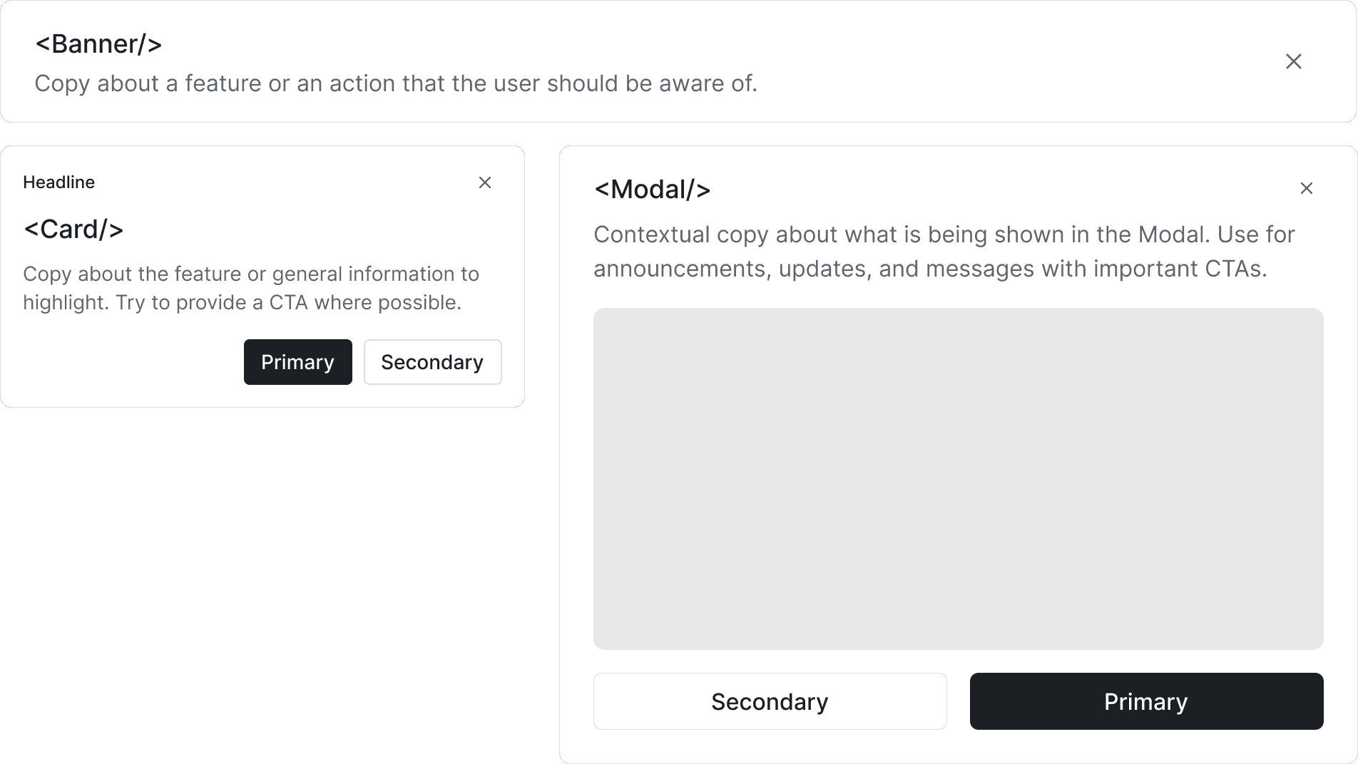
Variants
#A message type can have one or more variants. For example, the card template type comes with 3 variants:
- Default. Content with an action URL to determine where the cell should route to.
- Single action. Content with a single primary button.
- Multi-action. Content with two buttons, one primary and one secondary.
When creating an in-app template, your content editors can select from the available variants and customize the message's contents based on the selected variant.
Schemas
#A message type has a schema that defines the fields a message type will have in the template editor and forms the structure of the message contents generated when a message is produced from an in-app step.
You can think of the schema as a blueprint for how the content editor will create the message template and what fields can be edited within that experience. See the Schema reference doc for more information.
Template previews
#A template preview is a visual representation of what the message type will look like in the template editor. This provides a way for your content editors to understand what your front-end component will look like when a guide is rendered in your application.
You can draft template previews using HTML, CSS, and Liquid. This content will not be included in the generated message, and is only for preview purposes.
You can reference variables from your schema to customize the preview, like this:
You can also reference variant keys to customize the preview based on the variant that is selected in the template editor, like this:
Pre-built message types
#Knock comes with the following pre-built messages types to use out-of-the-box, each of which maps to a component you’ll find in @knocklabs/react.
Pre-built message types are immutable. If you need to add/update the schema of a pre-built message type, you can clone it and then archive the original.
Headless message types
#You can also create your own message types that map to your own UI components.
See the Creating message types doc for more information.
Versioning message types
#Message types are versioned using Knock’s commit model, meaning changes to a message type schema are committed into the current environment.
When you make an update to a message type, any templates using that message type will continue to use the old version until you explicitly update the template to use the new version. You can do this by navigating to the template in the Knock dashboard and clicking the "Update" button.