Feed
How to ship an in-app notification feed using our pre-built feed component.
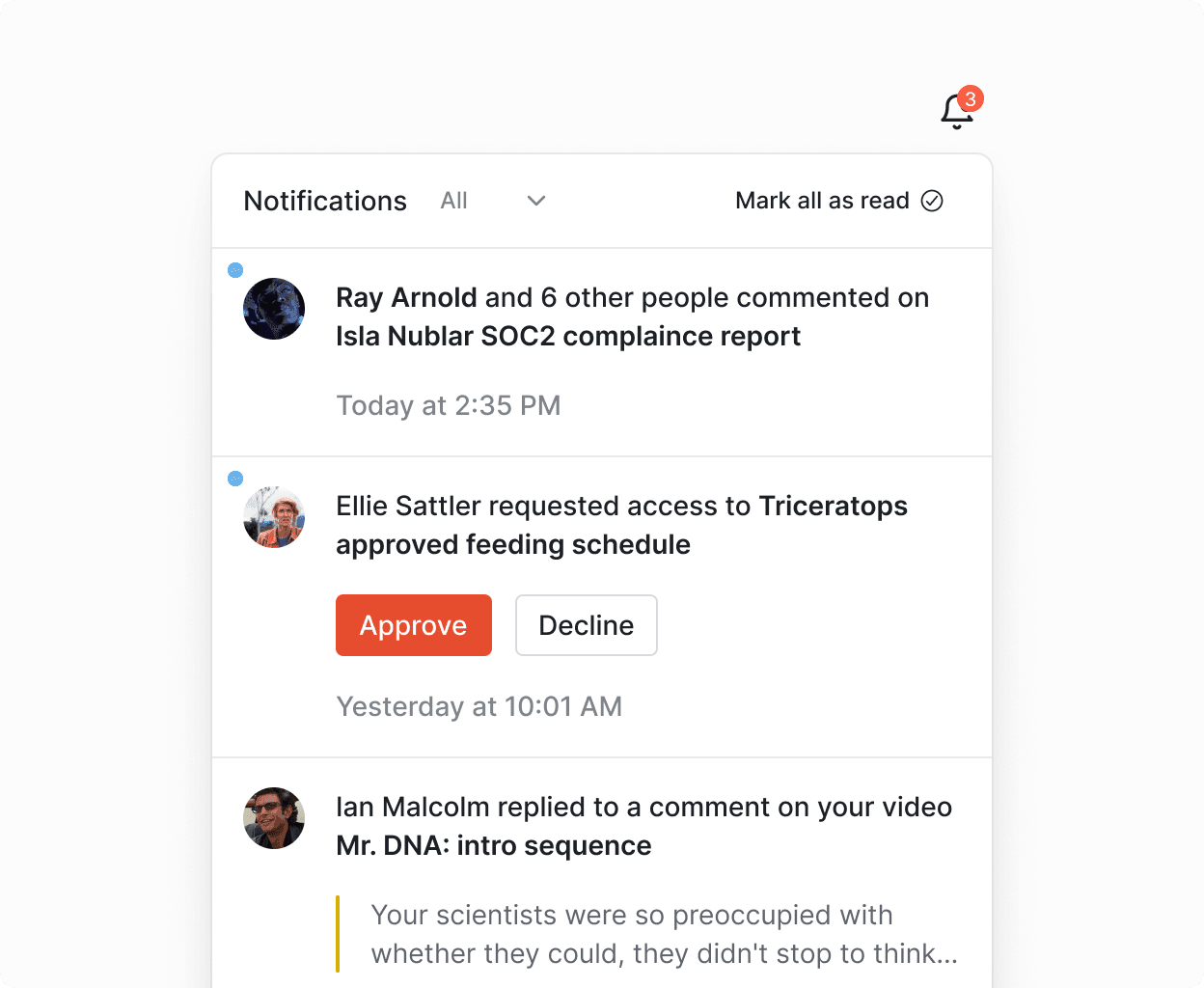
Our @knocklabs/react library comes pre-built with a real-time feed component that you can drop into your application. This page provides common recipes to help you work with the pre-built Knock feed UI element.
See a live demo of our pre-built in-app feed UI element.
Getting started
#To use this example, you'll need an account on Knock, as well as an in-app feed channel with a workflow that produces in-app feed messages. You'll also need:
- A public API key for the Knock environment (set as
KNOCK_PUBLIC_API_KEY) - The channel ID for the in-app feed (set as
KNOCK_FEED_CHANNEL_ID)
Installing dependencies
#Rendering the component
#To add a real-time notifications feed to your product, you can use the out-of-the-box components that the @knocklabs/react library offers.
UI/UX overrides
#Notification cell
#You can customize the rendering of a notification cell in the feed by overriding the renderItem prop.
For more advanced use cases, you may need to render custom components as part of the notification cell, but don't need to override the cell entirely. For this use case, you can use the children prop to render custom components inside the notification cell.
Notification cell avatar
#You can customize the Avatar component rendered within the NotificationCell by passing a different avatar component into the NotificationCell in the renderItem function passed to the feed:
Notification icon button
#You can update the notification icon to use read instead of seen for its badge count.
Dark mode
#The feed supports an optional colorMode prop, that defaults to light but can be set as dark for dark mode support.
CSS customization
#You can customize the appearance of the feed components in two main ways:
-
CSS variables: The feed uses CSS variables, which you can override to align with your product's design. Check the theme.css source code for available variables.
-
Custom CSS: You can completely replace the Knock CSS to tailor the feed's look. All feed classes are unique and start with
rnf-. View the component source code for class details.
If you import the component's CSS styles, you can use CSS variables to override most properties like colors and font sizes. These variables are prefixed with --rnf-. Refer to the theme.css file for a complete list.
Handling interactivity
#Redirect to a URL
#You can pass a value in the Action URL field of your notification template and the KnockFeedProvider will attach a redirect handler if action_url is not empty.
Add an onClick handler
#You can customize the click handler for the notification cell as follows:
Both the NotificationFeed and the NotificationFeedPopover take a onNotificationClick prop.
Add an onButtonClick handler
#You can add a button click handler to respond to clicks on the buttons in the notification cell. The onNotificationButtonClick prop is available on the NotificationFeed component:
Mark-as-read behavior
#By default the feed will mark all items as seen when the feed popover opens. You can change this behavior to mark items as read.
Socket behavior options
#Cross-browser feed sync
#The Feed optionally supports an __experimentalCrossBrowserUpdates option under the defaultFeedOptions which will opt into using a BroadcastChannel to keep multiple browser viewing contexts (windows, tabs) in sync for the same user feed.
You can see a demo of this behavior here:
Auto disconnect when inactive
#Optionally, you can configure the Feed to disconnect socket connections with inactive tabs after a brief delay. If the tab becomes active again, the socket will reconnect to continue receiving real-time updates.
Localization
#You can set custom translations for the components inside the feed by passing the i18n property to the KnockProvider component. You can provide a partial or full set of translations to be used following the expected I18nContent type.
Note: the default locale used in the components will be en. No other translations are provided out-of-the-box.
Filtering/scoping a feed
#A feed can be scoped by any of the parameters that are accepted on the feed endpoint via the FeedClientOptions set in the defaultFeedOptions for the KnockFeedProvider component, or via the useNotifications hook.
Status filtering
#The NotificationFeed component provides built-in support for filtering notifications by status (e.g., All, Unread). You can set the initial filter status using the initialFilterStatus prop:
The component manages its filter state internally and provides a default header with status filtering controls. If you need to customize the status filtering behavior, you can provide a custom header using the renderHeader prop.
You can read more in this documentation on feed filtering.